Analyzing Heart Failure Records Using 2-means Clustering
Collaborators: Dhruv Sood, Uposhanto Bhattacharya, Ramzy Oncy-Avila, Ellen Khachatryan
Dataset: Heart Failure Clinical Records
Table of Contents
- Analyzing Heart Failure Records Using 2-means Clustering
Background
Variables
The variables within the dataset contains 13 features, which report clinical, body, and lifestyle information:
| Clinical Feature Name | Clinical Feature Description |
|---|---|
| age | age of the patient (years) |
| anaemia | decrease of red blood cells or hemoglobin (boolean) |
| high blood pressure | if the patient has hypertension (boolean) |
| creatinine phosphokinase (CPK) | level of the CPK enzyme in the blood (mcg/L) |
| diabetes | if the patient has diabetes (boolean) |
| ejection fraction | percentage of blood leaving the heart at each contraction (percentage) |
| platelets | platelets in the blood (kilo platelets/mL) |
| sex | woman or man (binary) |
| serum creatinine | level of serum creatinine in the blood (mg/dL) |
| serum sodium | level of serum sodium in the blood (mEq/L) |
| smoking | if the patient smokes or not (boolean) |
| time | follow-up period (days) |
| death event | if the patient deceased during the follow-up period (boolean) |
The samples collected have been provided to us with a helpful description from the prior collectors by a table representing rows as patients and the features described as the respective columns.
Hypothesis
We hypothesize that there are some features that potentially influence heart rate failure considerably more than other features within the dataset. If this is true, we expect to observe two natural clusters in our data. We believe this can be tested by running a 2-means clustering algorithm, and repeating the process in multiple, higher dimensions. Is our dataset capable of predicting heart rate failure into clusters representing dead and alive by using 2-means clustering?
Methods
Why 2-means clustering?
The Heart Failure dataset contains 299 samples with 13 features; 12 input and 1 output. The output variable DEATH_EVENT reports a 1 or 0 respectively for each subject who has passed away or not after the initial data collection. With this binary value representation, we decided to use a 2 k means clustering to try and partition the features from the data into a total of two clusters. We do this to try to make the data points as similar as possible while also keeping these clusters as different (and as far) apart. Each cluster includes a “centroid” that is created by the mean (average) of the data points in that respective cluster that we use to determine the best or most likely state of the data. We wanted to see if correlations can be found by comparing these values from DEATH_EVENT to other groups of data.
Visual Comparison using Principal Component Analysis (PCA)
While we understand that the k means clustering process for working with specific parts of a dataset, we wanted to create scenarios that could potentially better assess the possibility for subjects dying per the features of the dataset.To better clarify this, we wanted to create multiple 2 k means clusterings of multiple features of our dataset by and then comparing the clusterings of these multiple feature clusters. We learned of a helpful method in attempting “Feature Selection” of the dataset, this would help in providing us the most relevant features out of our dataset to first try our clustering algorithm with. We hope to see a strong relationship between DEATH_EVENT and these features we select as they should be the more predominant features that influenced DEATH_EVENT. With this method we determined that Ejection Fraction and Time were the first two features we wanted to test and then followed up with being compared with the clusters from 7 Features of the dataset and another cluster of the entire dataset.
Normalization
Each of the variables in our dataset is has different units and ranges in values, with some being continuous values (serum_sodium), discrete values in the hundreds of thousands (platelets) or binary values either having a 1 or 0 (smoking, anemia, high_blood_pressure, etc). As such, to ensure consistency across all our data points and in order to use the k-means algorithm and PCA for visualization effectively, we had to normalize our data, which just subtracts the maximum of each feature from every value, and divides it by the maximum subtracted from the minimum. This ensures that all our points range from 0 to 1 and makes the data scale-free for easy analysis.
Results
import matplotlib.pyplot as plt
import random
from sklearn.model_selection import train_test_split
from sklearn.preprocessing import MinMaxScaler
from sklearn.cluster import KMeans
from scipy.spatial import distance
import numpy as np
import pandas as pd
import seaborn as sns
from sklearn.decomposition import PCA
%matplotlib inline
plt.style.use('ggplot')
Clustering in 2 Dimensions
# intialising KMeans for 2-means clustering
km = KMeans(
    n_clusters = 2, init='random',
    n_init = 10, max_iter = 100,
    tol = 1e-04, random_state = 0
)
data = pd.read_csv("heart_failure_clinical_records_dataset.csv")

# actual death event
actual = data.iloc[:,12]

# only use ejection_fraction and time columns
data = data.filter(['ejection_fraction', 'time'])

# scale/normalise data
scaler = MinMaxScaler()
norm = pd.DataFrame(scaler.fit_transform(data), columns=data.columns, index=data.index)

# calculate predicted clusters using 2-means
predict = km.fit_predict(norm.iloc[0:, 0:2])

# PCA to reduce to 2 dimensions
model = PCA(n_components=2)
results = model.fit_transform(norm)
first = results[:, 0]
second = results[:, 1]

f = plt.figure(figsize=(20,5))

# Plot 1: actual death event
survivors, dead = [], []
for i in range(299):
    if int(actual[i])==1:
        dead.append([first[i], second[i]])
    else:
        survivors.append([first[i], second[i]])

s_plot = np.array(survivors)
d_plot = np.array(dead)

f.add_subplot(1,2,1)
plt.scatter(s_plot[:, 0], s_plot[:, 1], color='green', label='Survivors')
plt.scatter(d_plot[:, 0], d_plot[:, 1], color='red', label='Dead')
plt.xlabel("Principal Component 1")
plt.ylabel("Principal Component 2")
plt.title("Actual Death Event, 2 dimensions")
plt.legend()

# Plot 2: Clustering
clus_0, clus_1 = [], []
for i in range(299):
    if predict[i] == 1:
        clus_1.append([first[i], second[i]])
    else:
        clus_0.append([first[i], second[i]])

c0_plot = np.array(clus_0)
c1_plot = np.array(clus_1)

f.add_subplot(1, 2, 2)
plt.scatter(c0_plot[:, 0], c0_plot[:, 1], color='orange', label='Cluster 0')
plt.scatter(c1_plot[:, 0], c1_plot[:, 1], color='blue', label='Cluster 1')
plt.title("2-means clustering, 2 dimensions")
plt.xlabel("Principal Component 1")
plt.ylabel("Principal Component 2")
plt.legend()
plt.show()

two_dim_s = s_plot
two_dim_d = d_plot
two_dim_c0 = c0_plot
two_dim_c1 = c1_plot

print("Clusters:", len(c0_plot), "C0,", len(c1_plot), "C1")
print("Actual:", len(s_plot), "survivors,", len(d_plot), "dead")
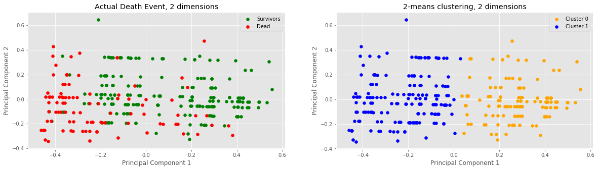
Clusters: 131 C0, 168 C1
Actual: 203 survivors, 96 dead
Through feature selection we decided to compare two dimensions: ejection fraction and time. After normalizing the data, conducting PCA on the data and running the 2-means clustering algorithm on the data, we noticed a vertical divide between the two clusters at x=0 or PC1=0. Samples with approx. x > 0 lie in cluster 0 and samples below approx. x < 0 lie in cluster 1. Furthermore, looking purely off of sample colorings, it would seem as if our 2-means clustering was successful in clustering our 2-dimensional data into two clusters.
Clustering in 7-Dimensions
# uploading the dataset
data = pd.read_csv("heart_failure_clinical_records_dataset.csv")

# actual death event
actual = data.iloc[:,12]

# dropping the values with booleans
data = data.drop(columns=['diabetes', 'sex', 'anaemia', 'high_blood_pressure', 'smoking', 'DEATH_EVENT'])

# scale/normalise data
scaler = MinMaxScaler()
norm = pd.DataFrame(scaler.fit_transform(data), columns=data.columns, index=data.index)

# calculate predicted clusters using 2-means
predict = km.fit_predict(norm.iloc[0:, 0:7])

# PCA to reduce to 2 dimensions
model = PCA(n_components=2)
results = model.fit_transform(norm);
first = results[:, 0]
second = results[:, 1]

f = plt.figure(figsize=(20,5))

# Plot 1: actual death event
survivors, dead = [], []
for i in range(299):
    if int(actual[i])==1:
        dead.append([first[i], second[i]])
    else:
        survivors.append([first[i], second[i]])

s_plot = np.array(survivors)
d_plot = np.array(dead)

f.add_subplot(1,2,1)
plt.scatter(s_plot[:, 0], s_plot[:, 1], color='green', label='Survivors')
plt.scatter(d_plot[:, 0], d_plot[:, 1], color='red', label='Dead')
plt.xlabel('Principal Component 1')
plt.ylabel('Principal Component 2')
plt.title('Actual Death Event, 7-dimensions')
plt.legend()

# Plot 2: Clustering
clus_0, clus_1 = [], []
for i in range(299):
    if predict[i]==1:
        clus_1.append([first[i], second[i]])
    else:
        clus_0.append([first[i], second[i]])

c0_plot = np.array(clus_0)
c1_plot = np.array(clus_1)

f.add_subplot(1,2,2)
plt.scatter(c0_plot[:, 0], c0_plot[:, 1], color='orange', label='Cluster 0')
plt.scatter(c1_plot[:, 0], c1_plot[:, 1], color='blue', label='Cluster 1')
plt.xlabel('Principal Component 1')
plt.ylabel('Principal Component 2')
plt.title('2-means clustering, 7 dimensions')
plt.legend()
plt.show()

sev_dim_s = s_plot
sev_dim_d = d_plot
sev_dim_c0 = c0_plot
sev_dim_c1 = c1_plot

print("Clusters:", len(c0_plot), "C0,", len(c1_plot), "C1")
print("Actual:", len(s_plot), "survivors,", len(d_plot), "dead")
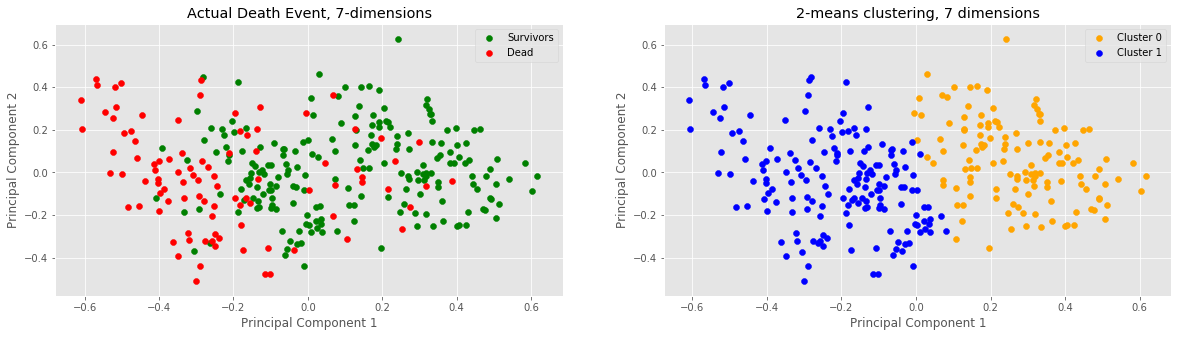
Clusters: 131 C0, 168 C1
Actual: 203 survivors, 96 dead
Our next step in analysis was to increase the dimensions of our data to 7 (this was done by including all non-binary data i.e. no data columns whose elements are either 0 or 1). Once again, notice a vertical divide between the two clusters at x=0 or PC1=0. Samples with approx. x > 0 lie in cluster 0 and samples below approx. x < 0 lie in cluster 1. It would seem that adding 5 more dimensions to our data did not change anything in terms of clustering numbers.
Clustering in 12-Dimensions
data = pd.read_csv('heart_failure_clinical_records_dataset.csv', header = None)
data = data.iloc[1:] # remove header column so they're indices
# scale/normalise data
scaler = MinMaxScaler()
norm = pd.DataFrame(scaler.fit_transform(data), columns=data.columns, index=data.index)
# calculate predicted clusters using 2-means
predict = km.fit_predict(norm.iloc[0:, 0:12])
# actual death event
actual = [int(elem) for elem in np.array(data[12])]
# PCA to reduce to 2 dimensions
model = PCA(n_components=2);
results = model.fit_transform(norm);
first = results[:, 0]
second = results[:, 1]
f = plt.figure(figsize=(20,5))
# Plot 1: actual death event
survivors, dead = [], []
for i in range(299):
if int(actual[i])==1:
dead.append([first[i], second[i]])
else:
survivors.append([first[i], second[i]])
s_plot = np.array(survivors)
d_plot = np.array(dead)
f.add_subplot(1,2,1)
plt.scatter(s_plot[:, 0], s_plot[:, 1], color='green', label='Survivors')
plt.scatter(d_plot[:, 0], d_plot[:, 1], color='red', label='Dead')
plt.xlabel('Principal Component 1')
plt.ylabel('Principal Component 2')
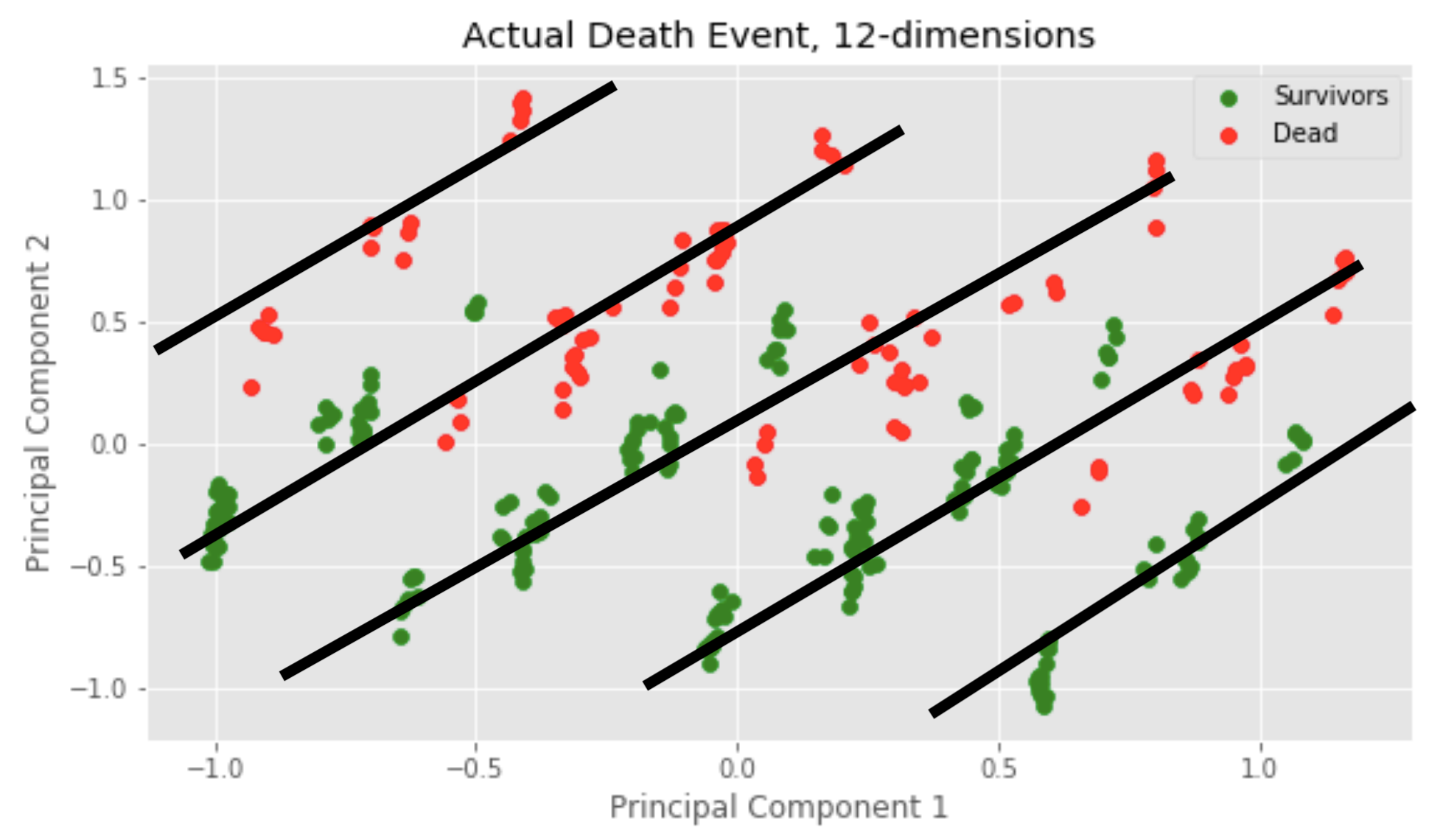
plt.title('Actual Death Event, 12-dimensions')
plt.legend()
# Plot 2: Clustering
clus_0, clus_1 = [], []
for i in range(299):
if predict[i]==1:
clus_1.append([first[i], second[i]])
else:
clus_0.append([first[i], second[i]])
c0_plot = np.array(clus_0)
c1_plot = np.array(clus_1)
f.add_subplot(1,2,2)
plt.scatter(c0_plot[:, 0], c0_plot[:, 1], color='orange', label='Cluster 0')
plt.scatter(c1_plot[:, 0], c1_plot[:, 1], color='blue', label='Cluster 1')
plt.xlabel('Principal Component 1')
plt.ylabel('Principal Component 2')
plt.title('2-means clustering, 12 dimensions')
plt.legend()
plt.show()
telv_dim_s = s_plot
telv_dim_d = d_plot
telv_dim_c0 = c0_plot
telv_dim_c1 = c1_plot
print("Clusters:", len(c0_plot), "C0,", len(c1_plot), "C1")
print("Actual:", len(s_plot), "survivors,", len(d_plot), "dead")
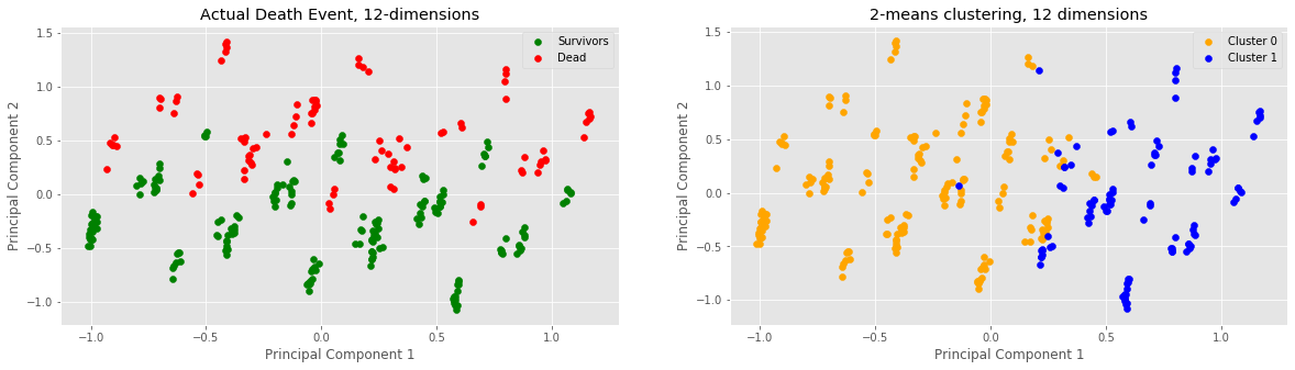
Clusters: 194 C0, 105 C1
Actual: 203 survivors, 96 dead
Finally, we observed what would happen if we attempted to cluster 12 dimensions of our data. This meant including all variables, i.e. also the boolean values. Based on the clustering assignment numbers, this seems to have been the most accurate trial because 194 is quite close to 203 and 105 is quite close to 95, relatively speaking. Something different is that the cluster vertical split no longer seems to occur at approx. x = 0, but rather a little bit after at approx. x = 0.3. Minor anomalies observed: two blue samples pretty deep in the yellow cluster.
Calculating accuracy of found clusters
After graphing all of our clusters, especially within the 2-dimensional and 7-dimensional visualisations, we can see the split between Cluster 0 and Cluster 1 occur at x = 0 where x = Principal Component 1, so Cluster 0 has a PC1 >= 0, and Cluster 1 has a PC1 < 0. Using our visualisations, we have also made clear that Cluster 0 most corresponds with Survivors and Cluster 1 corresponds with Died in the actual death event. Using this rough approximation, we can calculate the percentage of points within each Actual Death event clusters that lie within these bounds, and use it to explain the accuracy of the clusters we found using 2-means.
# 2-dim difference
two_s_count = 0
for i in range(len(two_dim_s)):
    if (two_dim_s[i, 0] >= 0):
        two_s_count += 1
two_s_p = (two_s_count/len(two_dim_s))*100

two_d_count = 0
for i in range(len(two_dim_d)):
    if (two_dim_d[i, 0] < 0):
        two_d_count += 1
two_d_p = (two_d_count/len(two_dim_d))*100

# 7-dim difference
sev_s_count = 0
for i in range(len(sev_dim_s)):
    if (sev_dim_s[i, 0] >= 0):
        sev_s_count += 1
sev_s_p = (sev_s_count/len(sev_dim_s))*100

sev_d_count = 0
for i in range(len(sev_dim_d)):
    if (sev_dim_d[i, 0] < 0):
        sev_d_count += 1
sev_d_p = (sev_d_count/len(sev_dim_d))*100

# 12-dim difference
telv_s_count = 0
for i in range(len(telv_dim_s)):
    if (telv_dim_s[i, 0] >= 0):
        telv_s_count += 1
telv_s_p = (telv_s_count/len(telv_dim_s))*100

telv_d_count = 0
for i in range(len(telv_dim_d)):
    if (telv_dim_d[i, 0] < 0):
            telv_d_count += 1
telv_d_p = (telv_d_count/len(telv_dim_d))*100


### Graphing bar-plot
dims = ['2-dim', '7-dim', '12-dim']
s_vals = [two_s_p, sev_s_p, telv_s_p]
d_vals = [two_d_p, sev_d_p, telv_d_p]

width = 0.3512
x = np.arange(len(dims))

fig, ax = plt.subplots(figsize=(10, 5))
rects1 = ax.bar(x - width/2, s_vals, label="Survived", color='green', width = width)
rects2 = ax.bar(x + width/2, d_vals, label="Died", color='red', width = width)

ax.set_ylabel("Percent (%)")
ax.set_title("Percentage of points in DEATH_EVENT that are in their corresponding 2-means cluster")
ax.set_xticks(x)
ax.set_xticklabels(dims)
ax.legend()
plt.show()

print("2-dim accuracy")
print("Survived:", two_s_p, "%")
print("Died", two_d_p, "%")
print("---")
print("7-dim accuracy")
print("Survived:", sev_s_p, "%")
print("Died", sev_d_p, "%")
print("---")
print("12-dim accuarcy")
print("Survived:", telv_s_p, "%")
print("Died", telv_d_p, "%")
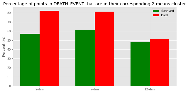
2-dim accuracy
Survived: 57.14285714285714 %
Died 82.29166666666666 %
---
7-dim accuracy
Survived: 61.57635467980296 %
Died 81.25 %
---
12-dim accuarcy
Survived: 47.783251231527096 %
Died 51.041666666666664 %
Using our findings of a vertical line at PC1 = 0 being the dividing line between Cluster 0 and Cluster 1, we decided to calculate how close these are to the actual death event by finding the percentage of points within each dimension’s death that are less than 0 (i.e. will be in Cluster 1), and the percentage of points within each dimension’s survivors that are greater than 0 (i.e. will be in Cluster 0). While the graph shows that 2-dim has the highest death accuracy percentage at 82.29%, we believe that 7-dim is the most accurate by providing the best balance between death and survivor accuracy (81.25%, 61.58%)
Discussion
An epic explanation!
The 12D clustering plot looks bizzare. What could be causing the sub-clustering/dense point colonies? We realized something cool: When we went from 7D to 12D, we added 5 boolean variables (0’s or 1’s) which tend to dominate the influence of the 7 other continuous variables which are distributed between [0,1]. Upon further analysis, we realized that the “sub-clusters” follow a linear pattern. In particular, there are five
of these linear patterns! We have never seen anything like this, but hypothesize that introducing 5 boolean values create this pattern!
Surface Level Results
We have confirmed that there are some features that potentially influence heart rate failure considerably more than other features within the dataset. These features are…
- Time
- Ejection Fraction
How did we prove this?
Since the cluster assignments in 2D and 7D were identical (Cluster 0: 131, Cluster 1: 168 in both 2D and 7D), it means that the addition of several other continuous variables in 7D didn’t have any sway on the clustering from 2D. This affirms the strength of “feature selection” because it proves that by selecting two most influential features, time and ejection fraction, from the beginning, we were able to efficiently reveal the natural shape/direction/clustering of the whole dataset!
We contrast the 2D and 7D plots’ equally-sized clusters (roughly half samples in cluster 0, roughly half in cluster 1) to the 12D plot’s disproportionate cluster sizes (194 in cluster 0, 105 in cluster 1).
We believe that clustering in 12D was “messy” because of the boolean variables. Remember – we normalized our data, which means that all continuous variables will be distributed in the range [0,1]. Boolean variables are either 0 or 1 so they can have a chaotic effect on the calculation to update the cluster center.
Key Takeaway
- The histogram on the left shows that clustering doesn’t improve (by much) going from 2D to 7D, and it actually degenerates going when we increase to 12D.
- It would be ideal if this data was able to be clustered very distinctly, but it reveals how ambiguous predicting heart failure can be, even with strong data points.
Limitations and Future Work
There were a few limitations we experienced while undertaking this project. One of these were more of a consideration rather than a limitation but we could have added even more different variations with the dimensions of the dataset and those also could have been added and analyzed to see how the different kinds of features resulted differently. Another one of our limitations we faced were introduced after we received the initial feedback for our research proposal, we were told that the values in this dataset are represented in a way that we discovered needed a better algorithm to properly and more accurately predict the heart failure rates given a specific clinical feature as labeled in our Introduction which led us to attempting logistical regression.